How to Maximize Your Landing Pages

In Lewis Carroll’s book Alice’s Adventures in Wonderland, Alice asks the Cheshire Cat which way she should go. He tells her it depends on where she’s going.
“I don’t much care where,” Alice said.
“Then it doesn’t matter which way you go,” said the Cat.
Sometimes you find people set up websites for their products and services without any inkling of an idea about what their goal for it is. What happens is website visitors stumble onto it, and quickly stumble out of it.
Money and effort spent posting blog posts, optimizing content for SEO, and driving traffic to the site go wasted when you succeed in getting your target audience’s attention but fail toconvert them to paying customers — unless your goal is purely to educate and brand.
If the purpose of your website is to sell a product or service, however, then it’s important to steer your target audience in the right direction, and set up an effective landing page.
A landing page is a powerful sales tool as it is a dedicated webpage that drives visitors to complete a single goal or call to action. Its main mission is conversion — of prospective customers to paying ones.
So how do you maximize conversion on your landing page?
There are best practices to remember while designing landing pages, and those are:
- Speak to your target audience. Empathize with them by highlighting how you’re removing their pain points. More importantly, in line with what Simon Sinek talks about in his famous TED talk, tell them why they are parting with their hard-earned money to buy your products/services. Most importantly, remember that a landing page is not yourblog where you rant or wax lyrical about your life. That’s what your blog is for.
- Make sure your content is engaging. With so many landing pages copying each other’s style, be a little creative to engage your audience. Provide short videos rather than text. However, if your target audience is in rural areas of developing countries where the cost of data is high and connection speeds are low, you might want to stick to text.
- Be concise. Besides the fact that it displays simple courtesy when you make it clear you don’t want to waste anyone’s time, an eye-tracking study shows that it takes users 2.6 seconds for their eyes to land on that area of a website that most influences their first impression. So the sooner you get to the point, the better.
- Provide testimonials and case studies of people who are happy with your solution. Also, provide a money-back guarantee if it doesn’t work for them.
- Give a clear, bright call-to-action that draws the reader’s attention.
How effective is an effective landing page?
To measure the effectiveness of a landing page, you’ll need to calculate its conversion, which is defined as the ratio of the number of people who buy the product and/or service to the number of people who visit the landing page.
But to understand how effective is effective, you can benchmark it against statistics provided by ImpactBound that states, “The average conversion rate falls around 2.35 %. The top 25 % are converting at 5.3 % while the top 10 % are looking at 11.45 % and above.”
However, it’s important to note that various factors such as your industry, product or service, target audience greatly influence the conversion rate.
“I’m here to help you.” — Adding Interactive Chats to Your Landing Page
Due to their prevalence, landing pages could sound both spammy and impersonal, so nowadays, companies are modifying them by adding an interactive chat window manned by actual people who ask, “Do you have any questions? I’m here to help you.”
This helps personalize the experience for the prospective customer. This tool comes with its own set of best practices, such as:
- Give the visitor some time to peruse your website before letting the chat pop open. Otherwise, they’re more likely to close it as they wouldn’t have had any questions yet.
- Mix up your default chat greeting and offline messages. When the greeting always starts the same way, it makes the chat sound like a bot, which defeats the purpose of personalization and interactivity that these tools are supposed to add.
- Respond to chats quickly. Waiting for someone to reply to you is frustrating. It’s better to not have the chat if you’re not going to manage it well.
- The people responding to visitors should have some sales experience. Rather than pick entry-level workers who are focused on customer service, man the chat with salespeople as those are more driven to close to the sale.
Keep Testing, Tracking, and Learning
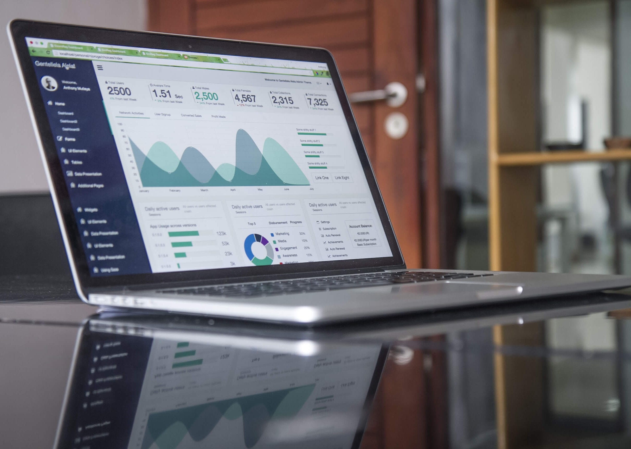
The good thing about websites is the ease with which tracking can be done. Also, perform A/B tests to measure the effectiveness of different designs, and see how each impacts conversions.
Just like many things, designing an effective landing page is more of an art than a science, so keep on learning and visiting different landing pages to see what works and what does. There are also various blog posts that list out the best landing pages, and break down the reasons on why some elements work and other don’t, such as this one.
Last but not least, remember to use landing pages as any other sales tool. Make sure to quantify the goals attached to it, and work to hit those goals.
Written with Amina Islam
